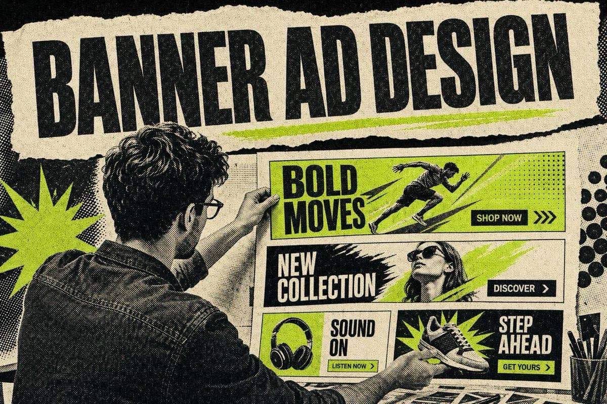
Good banner ad design comes down to five things: one focal point, a headline readable at the banner's real size, enough contrast to survive a busy web page, a logo that identifies you without taking over, and a call to action that looks like a button. If the banner is animated, the final frame must carry the whole message on its own, because on Google the animation has to stop within 30 seconds.
This page covers design only. For the campaign side (banner sizes, file limits, responsive vs uploaded ads, placements and testing), start with our guide to running web banner ads end to end, then come back here to make each size readable.
Design at actual size, smallest first
Most banner design goes wrong on a big monitor. A 728 x 90 leaderboard designed at 400% zoom looks spacious. At real size on a laptop it's a thin strip in the corner of someone's eye, and a 320 x 50 mobile banner is smaller still.
Two habits fix most of it:
- Start with the smallest size you will run. If the message works at 320 x 50, scaling up is easy. Going the other way almost never works, because a layout built for 300 x 600 has too many elements to survive the shrink.
- Review every size at 100% zoom on the device it targets. Put the mobile banners on a phone. Put the leaderboard on a laptop screen with a real article around it.
Visual hierarchy: three elements, in order
A banner gets a glance, not a read. Decide what the eye hits first, second and third, and give everything else less weight or remove it.
- The focal image or offer. The product, a face, or the number in the offer. One thing.
- The headline. The benefit in as few words as it takes.
- The CTA. What to do next.
The logo sits outside this ranking. It needs to be present and recognisable, not competing.
If you have a fourth element (a subhead, a badge, a second product), ask what it adds that the three above do not. Usually the answer is "nothing at this size", and it belongs on the landing page instead.
Layout follows from the shape of the slot:
- Wide units (728 x 90, 970 x 250): read left to right. Image left, headline centre, CTA right is the arrangement the eye expects.
- Tall units (160 x 600, 300 x 600): read top to bottom. Headline top, image middle, CTA bottom, logo near the CTA or at the top.
- Rectangles (300 x 250, 336 x 280): the most forgiving. Image as background or top half, headline over a solid area, CTA bottom.
Typography
- One typeface, two weights. A bold weight for the headline, a regular weight for anything else. More than that adds noise at small sizes.
- No thin or light weights. Hairline strokes break up on screens at banner sizes.
- Short lines. If the headline wraps to three lines on a 300 x 250, it is too long, not too small.
- Never shrink text to fit. Cut words instead. A headline that needs 9-pixel type to fit is the wrong headline.
Google makes the same point about logos in its responsive display ad specifications, advising advertisers to avoid small text, flair, and copyright or trademark symbols in logo assets. If small text is a problem in a logo, it is a problem everywhere in the banner.
Banners sit on pages you don't control, next to content and other ads, and low contrast makes them disappear.
Contrast
The Web Content Accessibility Guidelines set a minimum contrast ratio of 4.5:1 for normal text and 3:1 for large text. WCAG is written for web content rather than ads, but it is a sound, measurable floor. If your headline fails 4.5:1 against its background, some viewers will struggle to read it at all, and nobody will read it at a glance.
Practical rules:
- Never put text directly over a busy photograph. Use a solid panel or a strong overlay behind it.
- Check contrast with a tool, not your eyes. Any free contrast checker will give you the ratio.
- Separate the banner from the page. A banner with a white background on a white website needs a border or a coloured background so it reads as a unit.
Brand placement
The logo answers "who is this?" and nothing more. Keep it:
- In the same position on every size, so the set reads as one campaign.
- Clear of crowding. Google's guidance for responsive display logos is to centre and crop carefully and keep padding at about 1/16th of the logo's size, with a transparent background preferred (source). The same spacing logic works for uploaded banners.
- Smaller than the headline. If the logo is the biggest thing on the banner, the banner is about you, not the viewer.
Use brand colour for the background or the CTA button, not for everything. When every element is the brand colour, nothing stands out.
CTA design
The CTA should look like something you can press:
- A button shape, filled, with the highest contrast on the banner.
- A verb that says what happens: "Shop the sale", "Start free trial", "See plans". Not "Click here", not "Learn more".
- Room around it. A CTA jammed against the edge reads as decoration.
- The same position on every size, so it is where people expect it.
Animation rules
Animation can earn attention, but Google limits it. Per its uploaded display ads specifications:
- Animation length must be 30 seconds or shorter.
- Animations can loop, but must stop after 30 seconds.
- Animated GIF ads must run slower than 5 frames per second.
Separately, the Coalition for Better Ads lists flashing animated ads among the mobile web ad experiences that fall below its standard. It describes them as ads that "animate and 'flash' with rapidly changing background, text or colors." The definition is specific, so animations that do not flash are not covered. Movement is fine. Strobing is not.
To design within those limits:
- Design the final frame first. Most people see it, because the animation stops and the banner keeps sitting there. It needs the offer, the brand and the CTA.
- Use three frames at most: hook, proof or offer, CTA. Each one needs time to be read before it changes.
- Animate one element at a time. If the headline, image and button all move at once, nothing gets read.
- Don't animate the CTA into view alone at the very end of a sequence. Someone who glances at frame one should still see a way to act.
Mobile legibility
Mobile banners are the hardest design problem in display. A 320 x 50 unit gives you room for one line and a button.
- Keep it to one short line of text: the offer or the benefit, nothing else.
- Leave out fine print. Terms belong on the landing page.
- Show the logo or the product, not both, unless both are simple shapes.
- Use 320 x 100 when the message needs a second line rather than squeezing it into 320 x 50.
- Check the banner on a real phone, outdoors if you can. Glare is a contrast test you did not run.
Designing for responsive display ads
With responsive display ads you do not design the final banner. Google combines your images, logos and headlines and resizes the result to fit each slot, per its help page. That changes the design job:
- Keep the subject centred with space around it, so it survives resizing to different slots.
- Keep headline text out of the image. Google adds your headline as text, so text baked into the photo can end up duplicated or cut off.
- Supply every ratio (1.91:1, 1:1 and 9:16) so the system is not forced to stretch one image to fit another slot.
Common banner design mistakes
- Too many messages. Three benefits, a discount and a testimonial in a 300 x 250.
- Text over a photo with no backing panel.
- A logo bigger than the headline.
- A CTA that looks like a label, not a button.
- An animation whose last frame lacks the CTA or the offer.
- Flashing or strobing effects, which fall foul of the Better Ads Standards on mobile.
- Designing the big sizes first and shrinking them.
- Inconsistent layout across sizes, so the campaign does not read as one brand.
- Thin fonts and light grey text that vanish on real screens.
A quick before and after shows how much the rules do. A hypothetical skincare 300 x 250 starts with a model photo, a five-word slogan in thin white type over the photo, three bullet benefits, a large logo and a small "Learn more" link. Applying the rules: the photo becomes the top half, the slogan becomes a benefit headline in bold on a solid panel, two of the three bullets go to the landing page, the logo shrinks to the corner, and "Learn more" becomes a filled "Shop the serum" button. Nothing new was added. Everything that remained got easier to see.
FAQ
What makes a good banner ad design?
One focal point, a short headline in a bold weight, contrast that passes 4.5:1 for normal text, a logo that is present but smaller than the headline, and a CTA that looks like a button. For animated banners, the final frame must carry the full message, because Google requires animation to stop within 30 seconds.
How long can an animated banner ad be on Google?
Animation must be 30 seconds or shorter. It can loop, but all animation must stop after 30 seconds, and animated GIFs must run slower than 5 frames per second. Plan the final frame as a complete ad, since that is the frame left on screen once the animation ends.
What font size should banner ad text be?
There is no single official minimum for display banners, so test at real size. Review every banner at 100% zoom on the device it targets. If the headline is hard to read on a phone at arm's length, cut words rather than shrinking the type. Avoid thin and light weights entirely.
Should a banner ad include the logo?
Yes, but as identification, not as the hero. Keep it in the same position across every size, give it clear space around it, and make it smaller than the headline. Google's own logo guidance for display asks for careful cropping, padding of about 1/16th of the logo size and no small text.
Start from a layout that already works
Don't design from a blank canvas. Adapt a proven layout. The D2C Canva ad templates give you editable structures you can resize to 300 x 250 and 728 x 90, and the swipe file shows real ads whose hierarchy you can study before you design your own. For the reasoning behind single-image ads in general, read our guide to static ads.
The AI Ad-Making Kit
$99Make hyperreal AI video and image ads for any brand, with free AI tools. No camera, no agency.
- 10 modules
- 300+ hooks
- 500+ prompts
Canva ad templates, free.
Proven D2C ad layouts. Swap in your product, export, launch.
Browse templates →Want to act on what you just read?
Browse 3,400+ free, Canva-ready ad templates sorted by industry. One click to open, five minutes to customise.
Browse Free Templates